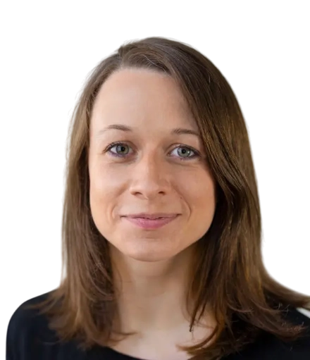
Sabine S.

Senior UI/UX Designer

Berlin, Germany

Experience

Jan 2021 - Dec 2021
1 year
Berlin, Germany

Site Campaign Tempelhof-Schöneberg (Grüner Hirsch)

Tempelhof-Schöneberg District Office

Following the motto "Short Paths to the Future", the business locations in Tempelhof-Schöneberg join forces with the Tempelhof-Schöneberg District Office to form a local alliance. This brings ecological business practices and innovative future projects into focus. The Grüner Hirsch Charter is a voluntary commitment and gives more visibility to sustainability topics and efforts in the district.

The idea of a joint marketing alliance that is also visually visible under one umbrella brand emerged in three workshops with representatives of the individual locations and networks. Under the motto "Short Paths to the Future", the participants formed an alliance with shared goals and values.

  • Eight guiding principles were created to inspire, motivate and support entrepreneurs on their personal journey toward greater sustainability.
  • Eight principles that offer space for exchange and synergy.
  • Visually, the deer, the coat of arms animal of Tempelhof-Schöneberg, accompanies the initiative with antlers made of interconnected lines.
  • The corporate design was developed based on the city of Berlin's design and optimized for barrier-free use.
  • Together with Caroline Oelsner (concept) and Stefanie Urbach (concept, editing), a flyer was created for the guiding principles with a call to participate, and a brochure in which different companies in the district are profiled and their contribution to the district is presented.
  • The website, which fits within the city of Berlin's CD framework, provides news and event information, but also offers the option to join the charter directly and get in touch with the team that oversees it.
  • All media were implemented in a barrier-free way and approved by the Berlin city's Commissioner for Accessibility.
  • Main tasks: concept, design, UI/UX, editorial consulting, final artwork, production supervision.
Jan 2020 - Dec 2020
1 year

Corporate design, website and information media for Future Center Brandenburg

Research Institute for Workplace Learning (f-bb) non-profit GmbH

Under the motto "Shaping Work Together", the Future Center Brandenburg supports companies from all sectors in digital and demographic change. The Federal Ministry of Labour and Social Affairs (BMAS) initiated the Future Centers to support small and medium-sized companies in the digital transformation. Future-proof and innovative work and learning processes are developed together with and in the companies, leading to very concrete solutions and applications.

We were hired in the founding phase by the Future Center Brandenburg to implement its corporate design, a complex website and various other media.

  • For the logo, we developed a graphic symbol that makes the letter Z "light up" digitally through a technical design. The corporate design is based on a dynamic form, a realistic image language that invites identification, and uses four colors. Teal is assigned to "knowledge", green to "doing". Pink is used for targeted highlights and sand serves as a neutral background tone. One challenge was finding a good balance between a modern look appropriate to the theme and the down-to-earth nature of the target groups, many of whom are in crafts and care professions.
  • The website was built with the WordPress content management system (CMS) and includes many complex modules and automations that link content and offer target-group-oriented solutions across different subpages.
  • The website is also designed so it can be expanded step by step and modules activated once enough content has been added.
  • Main tasks: concept, design, consulting, final artwork, programming.
  • Collaboration: Sebastian Brümmer and Sören Schumann (programming).
Jan 2018 - Present
7 years 8 months

DRA – Corporate design, annual report, website

German Broadcasting Archive – Foundation of ARD and Deutschlandradio

The German Broadcasting Archive (DRA) is the first and oldest joint institution of the public broadcasters in Germany, known as ARD (Consortium of Public Broadcasters in the Federal Republic of Germany). With the acquisition of the program assets of radio and television from the former GDR, the DRA added a second location in Potsdam-Babelsberg on the RBB grounds, alongside Frankfurt.

For more than 50 years, the DRA has been active as an archive and documentation center: it uses various products of modern information technologies to handle its tasks. However, the website and corporate design have grown organically over recent years and decades, and we were tasked with completely redesigning the website and structurally conceptualizing it, of course in close and comprehensive collaboration with the clients.

  • The new website not only provides information, it also invites visitors to linger, for example through exciting articles/archive entries in the topic portal, which we laid out in a "magazine-like" design.
  • Since a quick online launch was required, not all planned content and special features could be prepared by December 2018. For this reason, we designed a highly modular structure that allows for a gradual online release of content still in development.
  • The technical implementation was done in close dialogue with the DRA’s Typo3 web team.
  • To make the website as modern as possible, we simultaneously revised the existing corporate design, which is now also used in print media, such as the 2018 annual report designed by us.
  • Main tasks: concept, design, UI/UX, editorial consulting, final artwork, production supervision.
  • Collaboration: Bea Stach.
Jan 2017 - Dec 2021
5 years

Coordination Office for Democracy and Diversity in Daycare

Association for Child and Youth Welfare – AGJ

Under the motto "Democracy and Diversity in Daycare", the leading associations of independent welfare organizations, the Association for Child and Youth Welfare – AGJ, and the Federal Ministry for Family Affairs, Senior Citizens, Women and Youth want to jointly advance democracy education, awareness of diversity, and participation in early childhood education, care and upbringing. The welfare associations manage about two thirds of daycare centers and day care services nationwide. They carry out their own projects as part of the cooperation. Within the overall project, the AGJ takes on a coordinating role.

The overall presentation of the Coordination Office is aimed primarily at educational and non-educational professionals as well as parents and parent representatives. We developed a corporate design that addresses all participants in a positive and confident way.

  • The theme of diversity is reflected in the different shapes and colors. Aesthetically, we were inspired by children’s drawings.
  • The flexible patterns and structures, which work both with and without images, create a universe of possibilities to be used across different media.
  • This allowed us to produce a series of information materials and giveaways and to launch a comprehensive website.
  • In addition to various special pages and pre-made templates, the website offers a highly automated newsletter system. Blog posts, event announcements, press releases and info library descriptions can be inserted into a precise layout and a custom HTML newsletter at the touch of a button.
  • Within the intuitive CMS system (Django), there is an easy-to-use toolkit that allows the automatically created newsletter to be edited as desired with just a few clicks.
  • Various other media are currently in planning.
  • Main tasks: concept, design, UI/UX, editorial consulting, final artwork, production supervision.
Jan 2016 - Dec 2017
2 years

Scalefree – agile Big Data Management

Olschimke Consulting GmbH

Government institutions and companies typically build extensive IT systems over many years, often in different subject areas using different technologies. Expanding and linking such systems is extremely complex and costly. Dan Linstead is the inventor of the Data Vault method and, together with Michael Olschimke, founder of the big data consulting company Scalefree. The Data Vault 2.0 method enables a previously impossible, comparatively very simple way to agilely expand and link existing databases. It is the primary product of Michael Olschimke Consulting GmbH, along with general consulting and training services.

We were commissioned to develop a visual identity as a brand and company for Scalefree, under which Olschimke Consulting GmbH presents itself externally.

  • A key design element is the graphic symbol of the logo, which represents the Data Vault 2.0 method in particular and data connections in general as an infinitely expandable pattern.
  • In addition to a specific typography, a consistent color palette, and a coherent layout line, an individual image style ensures strong recognition – for this, we collaged an extensive set of illustrations to stand out clearly from the existing market.
  • A guide for portrait photography and the use of photos was also defined.
  • In addition to developing the corporate identity and corporate design, we created the business stationery and a modern website.
  • To support the smooth course of Scalefree's international business activities, we optimized the relevant media for Google Docs and Slides to correspond with the Microsoft Office templates.
  • Main tasks: consulting, concept, design.
Jan 2015 - Dec 2015
1 year

up2fuel – Corporate Desing

up2fuel

up2fuel is an innovative production process for upcycling plastic waste into fuel. The process is patented worldwide and, since October 2015, has been a registered brand. The special feature of the process lies in its overall efficiency of 85%, achieved through efficient heat transfer when heating the plastics.

To attract global investors for the pilot plant, we were commissioned to design and implement the Corporate Design, business stationery, an information flyer, and a website.

  • The rainbow-like play of oil is the key visual of the identity and is reflected in the color concept.
  • Together with the hexagon as a symbol for the chemical building block (carbon) of the process, the drop – and thus the fuel production – is the central theme.
  • The geometric shape of the logo is echoed in the distinctive typeface, which, as a central element of the design, supports high recognition.
  • The presentation of the innovative, technically high-quality product is reinforced by the reduced and clear visual language, as well as by the use of exclusive hot foil stamping in contrast to uncoated paper. This creates an interesting combination of look and feel not yet seen in the technology sector.
  • An information graphic integrated as a poster in the flyer rounds off the communication and explains the complex process in a way that is easy to understand for laypeople.
  • Main tasks: consulting, design, production coordination.

Summary

Sabine Seifert (née Brambach) has known the Alps since childhood as the real backdrop behind her home garden, even with the alpenglow. In her Berlin exile she has worked at various mid-sized, large and very large agencies and proven herself. In addition to a wide range of skills in various design disciplines, her passion has always been the concept and design of digital media, especially apps, with a strong focus on user-centered design. Sabine holds a diploma in communication design and studied at both FH Munich and the Academy of Art University in San Francisco.

Languages

German
Native
English
Advanced

Education

Oct 2006 - Jun 2007

Academy of Art University

Communication Design · San Francisco, United States

Oct 2001 - Jun 2006

FH Munich

Diploma in Communication Design · Communication Design · Munich, Germany

Need a freelancer? Find your match in seconds.
Try FRATCH GPT
More actions